Early Stages
After a partnership was established with eBay in 2014, I was brought on as a consultant to reinvent the UI/UX for Trusted.com’s suite of products which included a consumer-facing web product, an in-store iOS product for retailers (Tag Heuer, Richard Mille, and National Geographic Fine Art Galleries) and a consumer/retailer dashboard to manage eTitles and products.
Stakeholders also requested we incorporate an e-commerce component into the B2C product in addition to a store finder, eTitle look-up, eTitle transfer, and additional product features that I included in the initial product requirements.
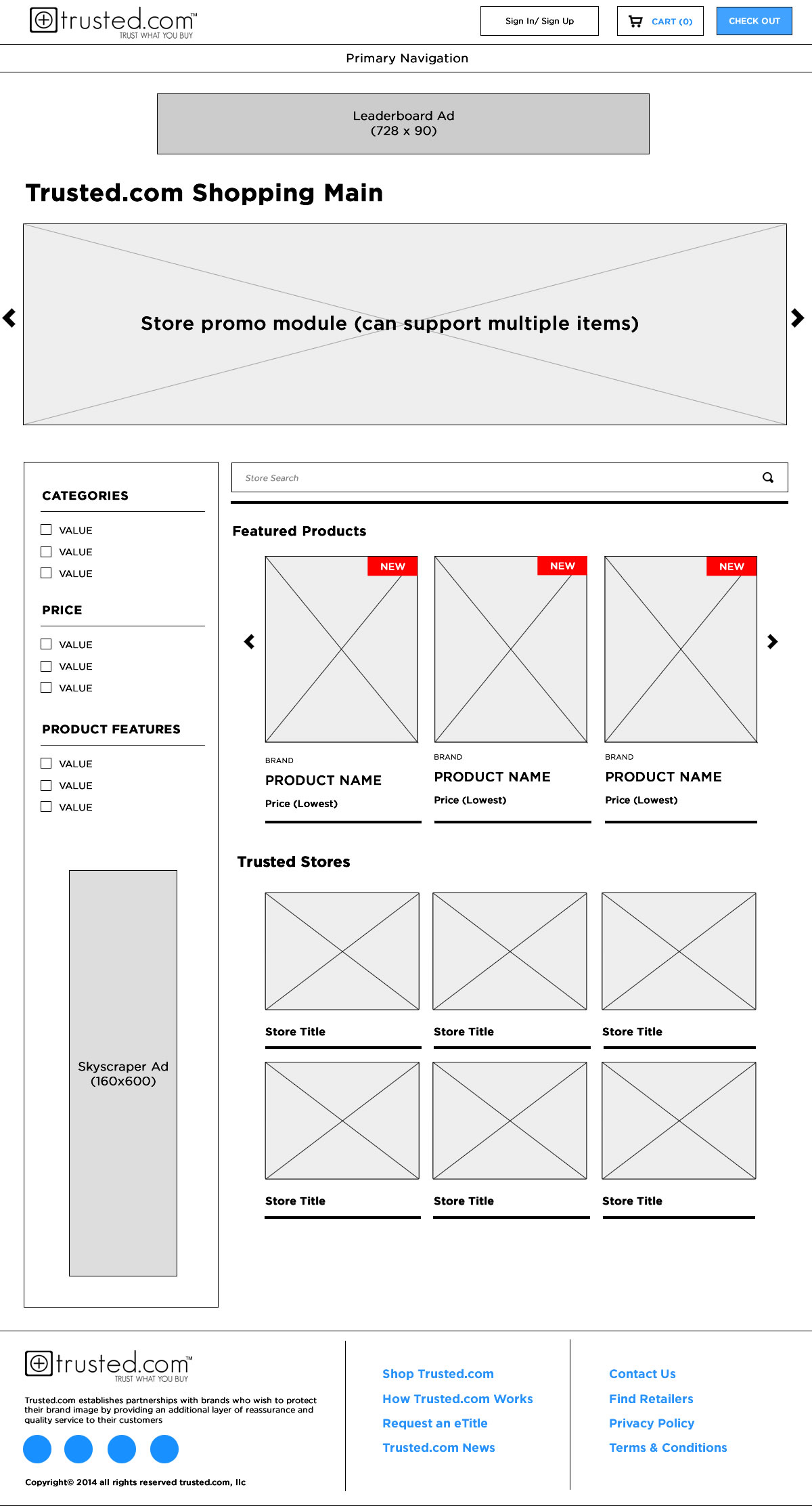
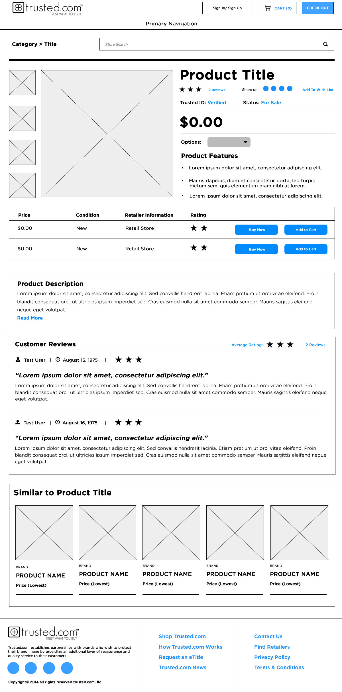
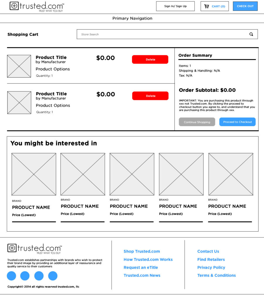
During the requirements stage, I began working on the initial wireframes for the consumer-facing web product as the UI/UX from the primary product would dictate the look and feel of the additional products we built.
Concurrently working with the Product Development team, we established the tech stack to ensure the scaleability of the products as well as speed as the current products were sluggish and nearly unusable for the retailers. We would also need to custom-build a CMS as the current product required the developers edit the database directly.
Working with the Trusted project manager, we implemented an Agile environment and began to map out sprints in Jira for the design and development teams. As my work overlapped both teams (I designed the wireframes but also handled front-end development,) it was important that I maintained an organized repository of assets and requirements to ensure a clean transition from front-end to back-end.
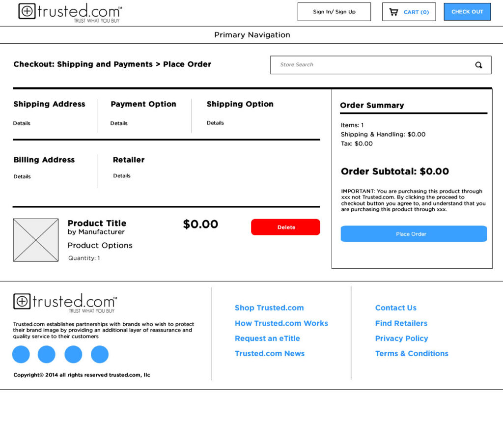
Introducing the UI
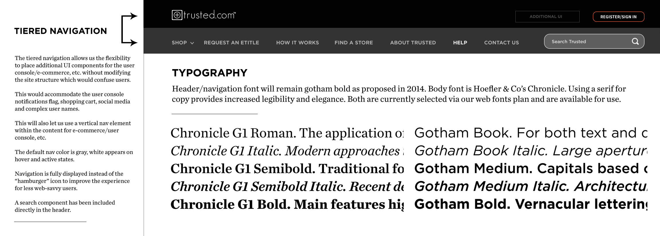
Once I received sign-off on the wireframes from the CEO and additional Stakeholders, I began work on the style guide for the products. To ensure we kept the focus on the content and products offered by retailers.
This was based on feedback from retailers who felt the original version was too busy and confusing to navigate. As a result of the guidance received, I went with a muted palette of grays to balance the bright colors found in fine art and luxury watches.
For the typography, I used 2 fonts from Hoefler & Co; Gotham and Chronicle, a sans-serif and serif, and additional iconography was pulled in from FontAwesome. Specifically social media icons.
While we would eventually use less of the serif in the final products it would become a prominent feature in later marketing collateral.
Within the style guide, I also began to establish the brand guidelines for Trusted.com.

Prototyping
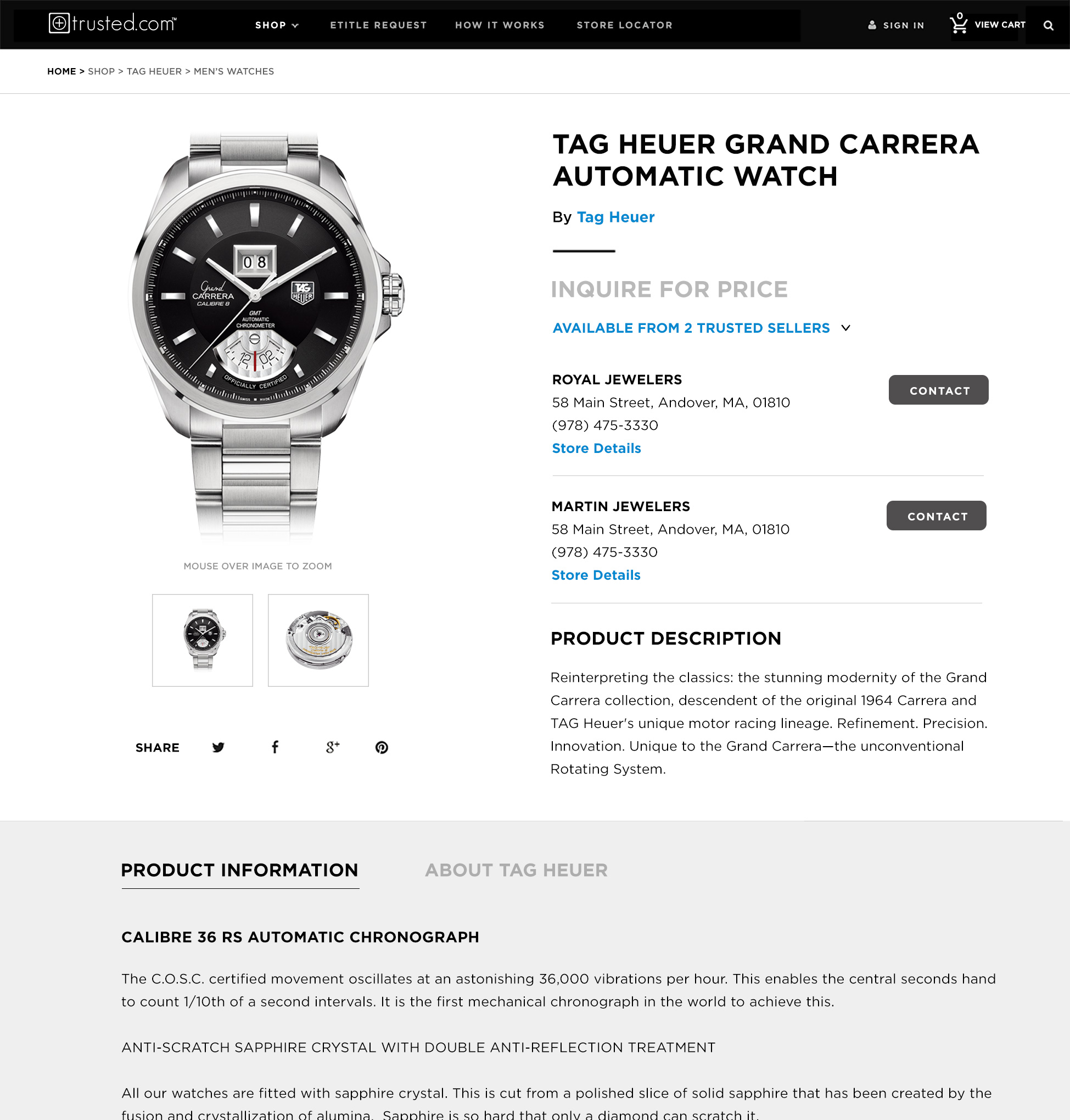
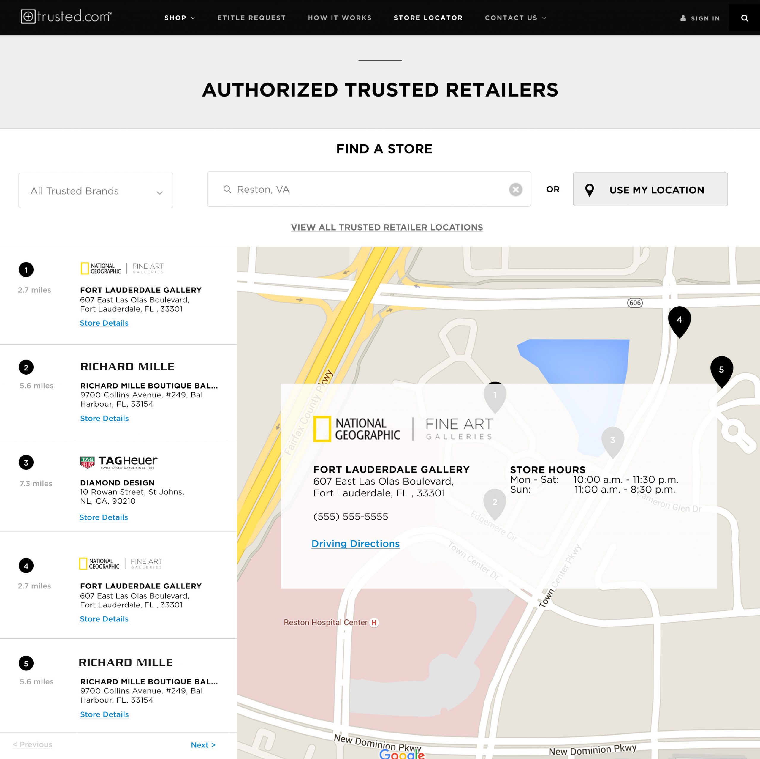
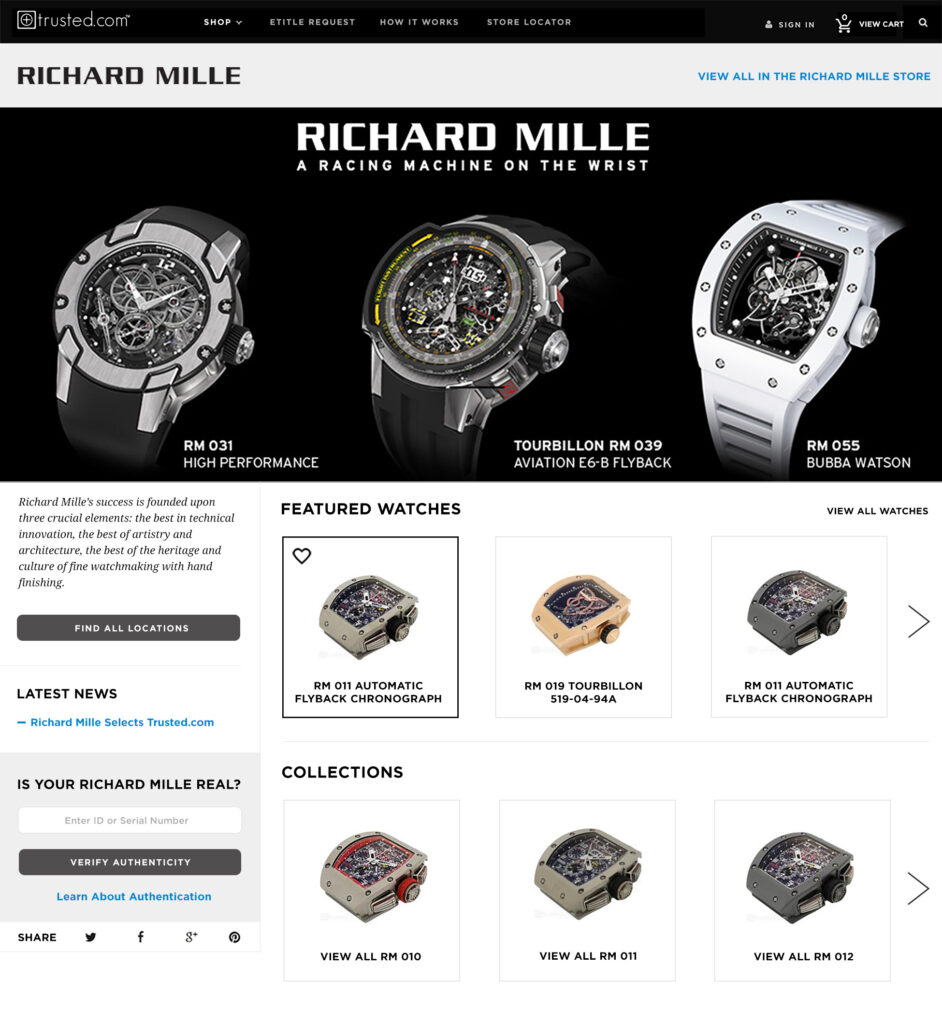
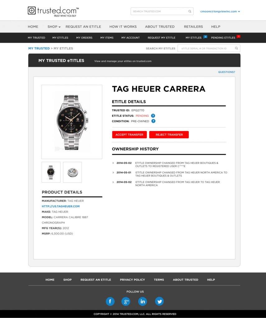
With wireframes completed and the style guide approved, I began designing the mock-ups for the B2C product. I focused on the retail product pages first as Tag Heuer expressed interest in viewing this stage of the process as they were redesigning their own site and wanted to incorporate some of the UI/UX we were developing.
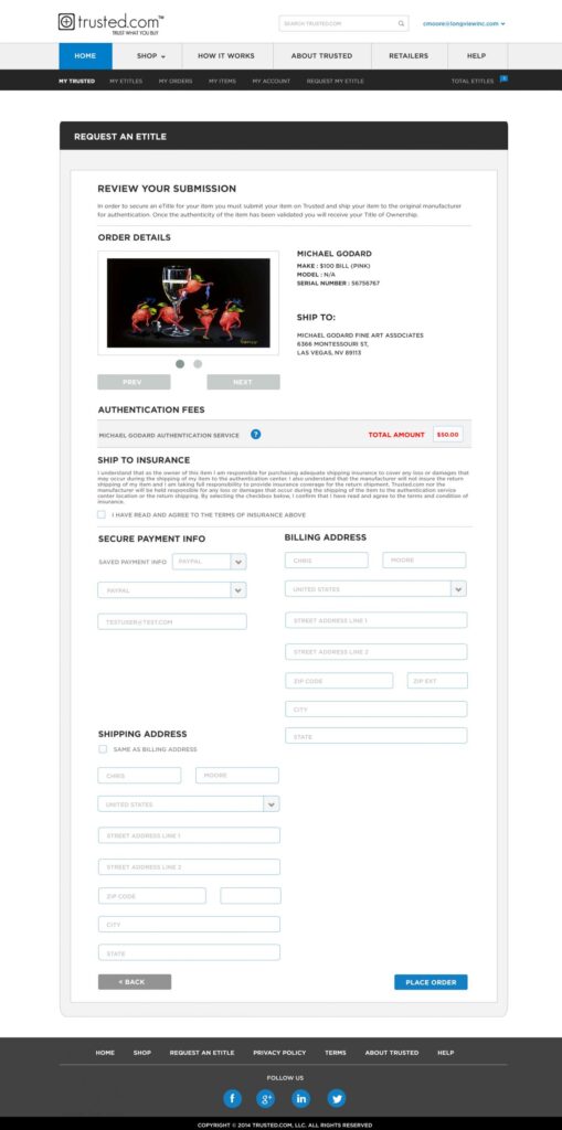
Since the requirements for the product pages were complex, it was important to make sure the UI was clean and minimal and the UX was transparent to the user. This was critical since we were eliminating the account management dashboard and creating a streamlined experience for users. Giving them the ability to manage and sell their luxury goods in real-time.
The product pages needed to successfully incorporate e-commerce components, product information, retailer information, and social media elements.
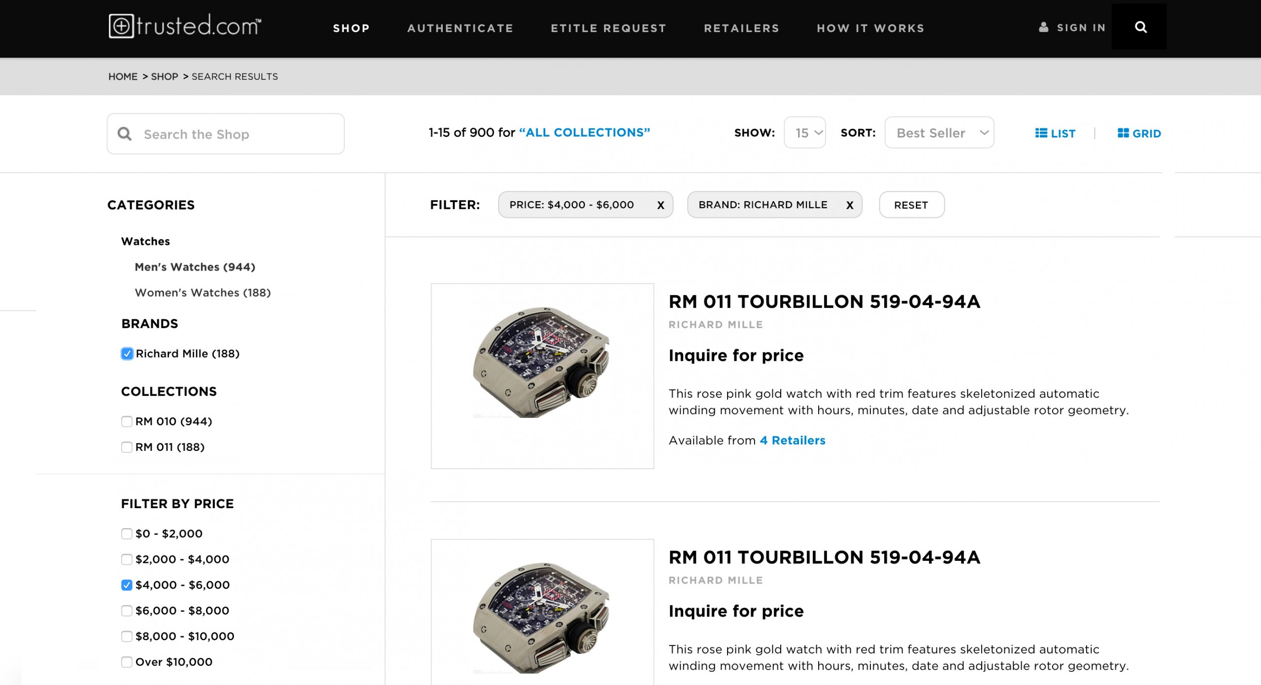
The search page requirements evolved as I began designing and realized we needed to offer users a more robust filtering system for searching as the complexity of products required a different set of requirements for each product type (fine art, watches, etc.)
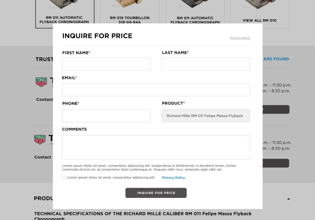
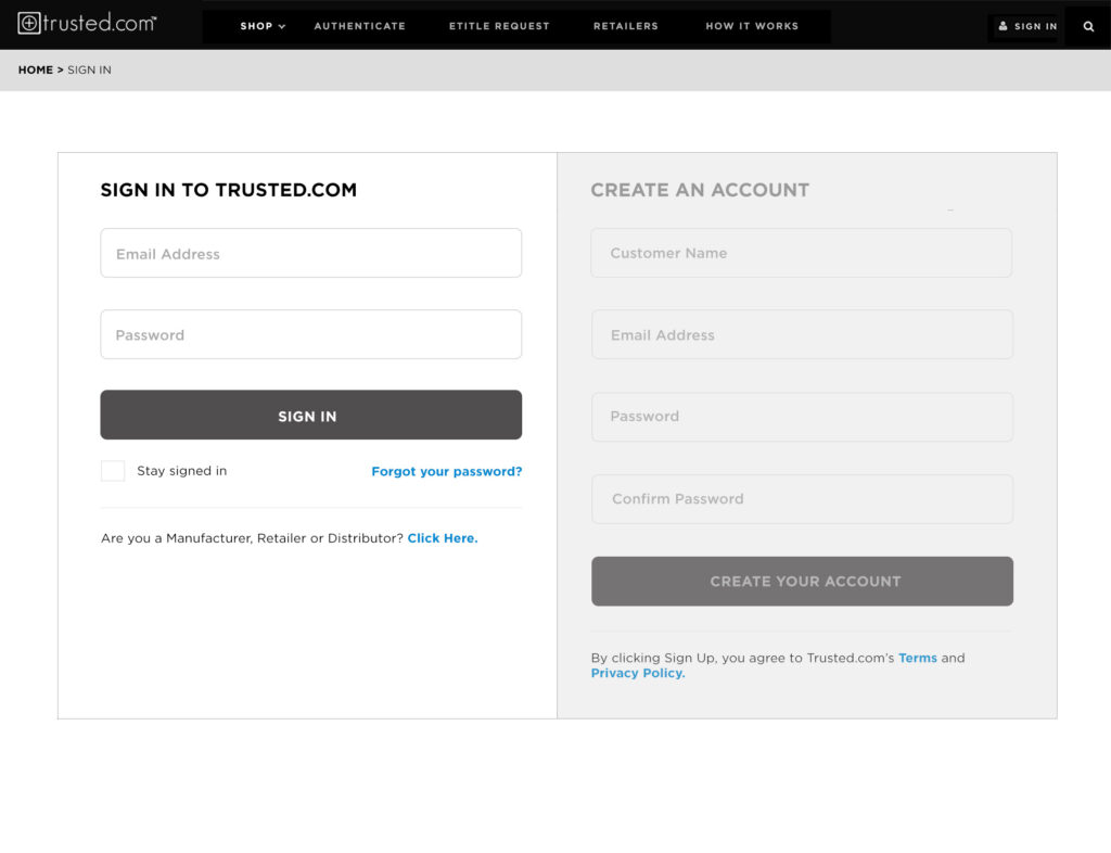
With so many different functionality components, it was important that I worked concurrently with the Development team during the wireframing stage to ensure I was addressing all of the components of UI that were required within the framework. Modal windows, form fields, buttons, etc. were all designed and included within the style guide and updated requirements.
Launch
Trusted.com was a complex project that required a robust suite of products handled by a modest design and development team. In the initial phase, the B2C product took over 2 years to complete as we incorporated user groups, A/B testing, and stakeholder reviews to ensure the final product met the needs of users, retailers, and stakeholders.
A final piece was to develop a product template for eBay to include within product pages for luxury goods retailers to track pre-owned products that had existing eTitles or for new products that the retailer could include an eTitle for. This would help reduce fraud and ensure the customer was purchasing an authentic product.
After the first month, site users increased by 1800%, traffic by 2400% and we tripled our eTitle count in the first week we relaunched the site.
Development for the additional Trusted.com products would continue until 2020.
