Concept:
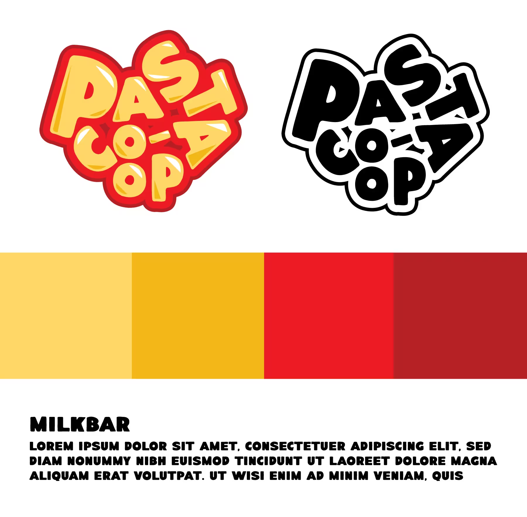
Pasta Co-Op, a Cleveland-based pasta restaurant, sought a brand reinvention that would elevate their identity and reflect both the quality of their food and their connection to the local community. Rather than following typical industry trends of pasta logos featuring squiggly fonts, forks, and bowls of pasta, we chose a more subtle, sophisticated approach. The new logo design evokes the essence of pasta in a way that feels fresh and modern, with an element of surprise—when you recognize what it is, it perfectly encapsulates the brand’s values and connection to the food they serve.
Design:
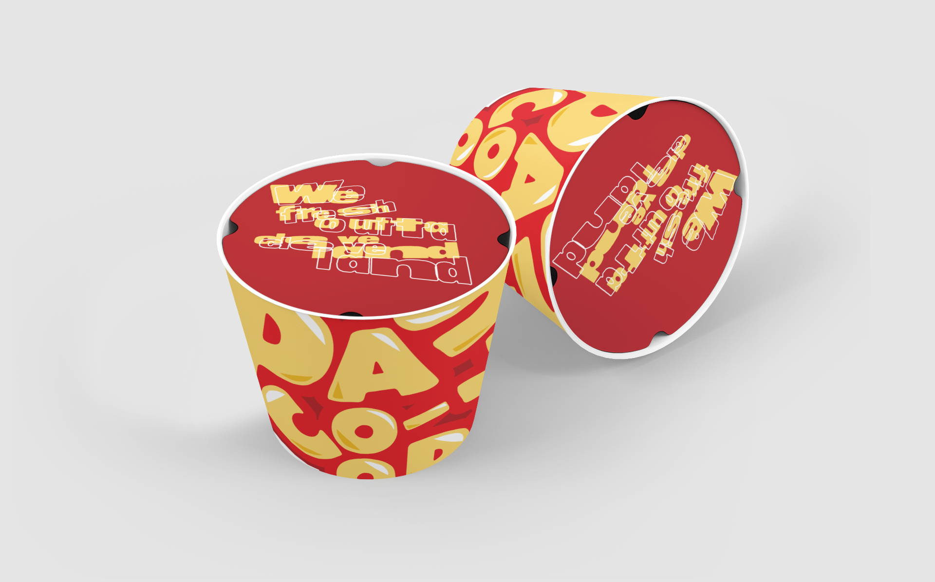
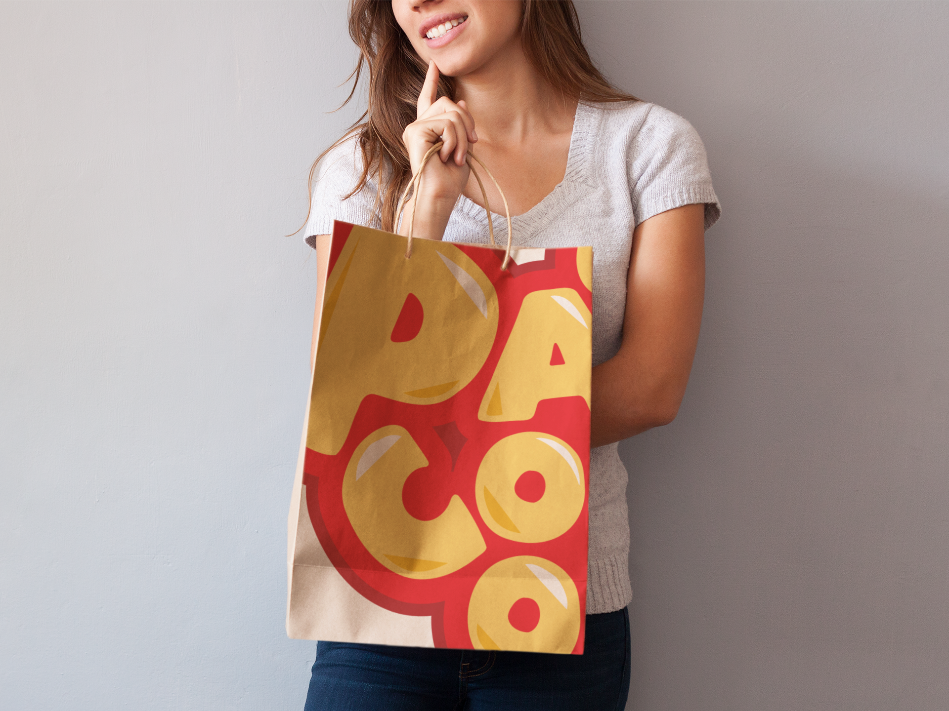
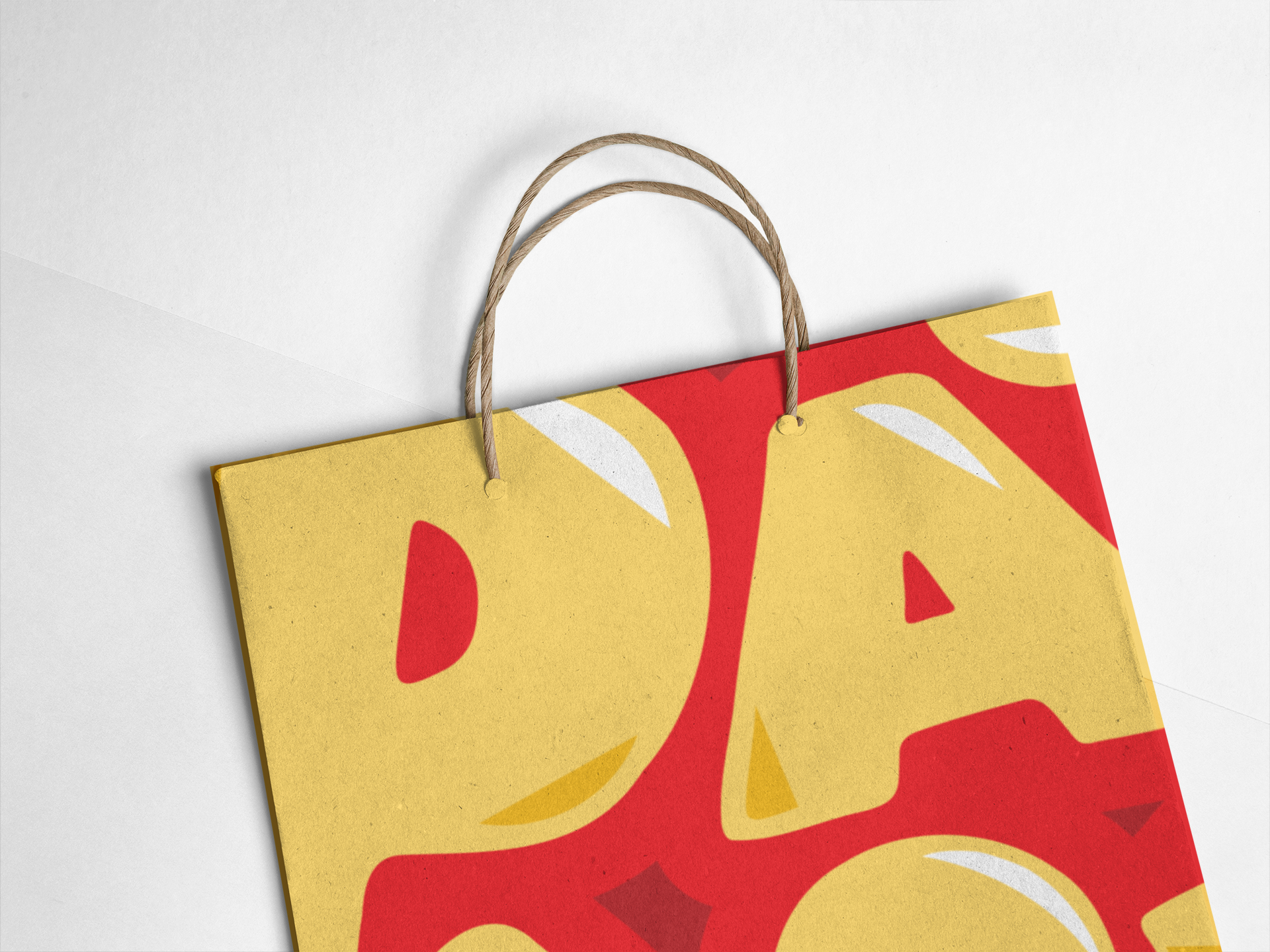
The logo design departs from the usual pasta imagery, opting for a more refined and abstract representation that feels both contemporary and meaningful. The color palette, initially inspired by the traditional red sauce pasta dish, turned out to be strikingly similar to the Cleveland Cavaliers’ team colors—a happy coincidence we embraced as a nod to the city’s pride. We also developed the tagline “We Fresh Outta Cleveland,” which emphasizes the local roots and authenticity of the restaurant. Additionally, we designed a suite of packaging for takeout and delivery, as well as merchandise options, to give Pasta Co-Op a cohesive and appealing visual identity across all touchpoints.
Challenges:
A major challenge was stepping away from the predictable, on-the-nose imagery typical of pasta restaurant branding. The goal was to create something unique that still communicated the essence of the business without being overly literal. Another challenge was balancing the restaurant’s local Cleveland identity with a broader appeal, ensuring the brand felt relevant and fresh while maintaining a sense of place and community.
Vision:
The vision for Pasta Co-Op’s new identity was to create a brand that stood out in a crowded market while honoring its Cleveland roots and commitment to quality. By shifting away from traditional pasta imagery and leaning into a more refined, modern aesthetic, we aimed to position the restaurant as an elevated dining experience that still feels approachable and authentic. The tagline and design elements work together to create a strong, memorable brand that customers can connect with, reinforcing both local pride and the restaurant’s focus on fresh, high-quality food.